“I have a website, but I get nothing from it.”
This is something we hear quite regularly from business owners, but it certainly should not be the case. There are many reasons why a website isn’t converting, but to get started solving your website woes, we have put together our top four reasons – plus what you should do about them.
Search engine optimisation (SEO)
No doubt you have heard about SEO numerous times before (and you can read even more about it in our other blogs), but if we sound like a broken record, it’s for a good reason. SEO is important.
Why do we talk about SEO so much? Search engine optimisation is a process that improves your website searchability and ranking. Without SEO, your website is unlikely to rank well, which means it is unlikely to be found by prospective customers. In the online business world, ranking is where success lies.
SEO can be a confusing beast, and there is more to it than most small business owners realise. A typical SEO strategy includes the following:
- Keyword research
- Content creation
- Content marketing
- Internal and external linking
Each of these points will be covered in more detail in later blog posts, but for now we will focus on identifying problems with your website to get it working better for you.
The simplest way to fix your SEO is to outsource to someone who has studied the intricacies in more detail, however, sometimes a small business budget does not allow that. To get started improving your SEO yourself, here are four steps:
- Do some keyword research
- Put these keywords into your website content
- Ensure you are using internal and external links
- Avoid the “HACKS”
Mobile-friendly website
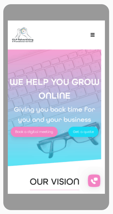
The second biggest problem we find with client websites is they are not mobile-friendly. It has been estimated that over 50% of consumers now use their phone to research goods and services (such as while in front of the TV at night!) so having a mobile-responsive design is VERY important.
Whenever you make changes to your website, it is important to go in and look at the site on the mobile version to check everything is where it should be. This goes even for platforms such as Wix or some WordPress themes that are promoted as including mobile-responsive design.
When it comes to optimising your website to mobile, remember the old acronym KIS – keep it simple. Lay out the important information at the top and use your content to guide visitors down the page. We have more information on creating content that converts in an upcoming blog post, so stay tuned!
While mobile-friendly design is important for all websites, if you have an e-commerce site it critical to test on both devices. To buy through e-commerce, the user needs to easily and securely enter details such as card numbers and shipping details. Too many errors or an unclear or incomplete form will likely cause them to abandon their cart…which means no sale for you.

Call to action (CTA)
Another common error we see on ill-performing websites is the lack of CTAs. Don’t assume your visitor will use their initiative and seek out a way to contact you, make it blatantly obvious! To explain the CTA a little better, here is a screenshot of our website and actionable buttons.
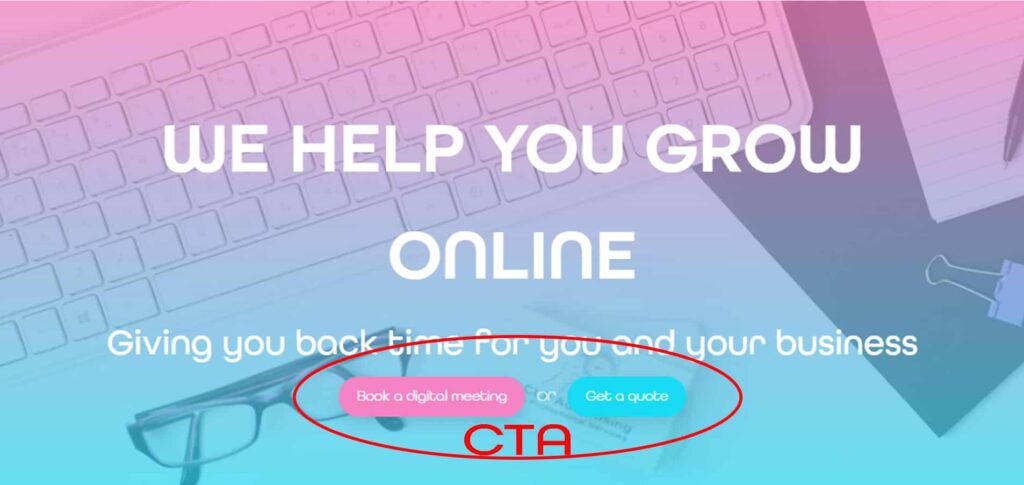
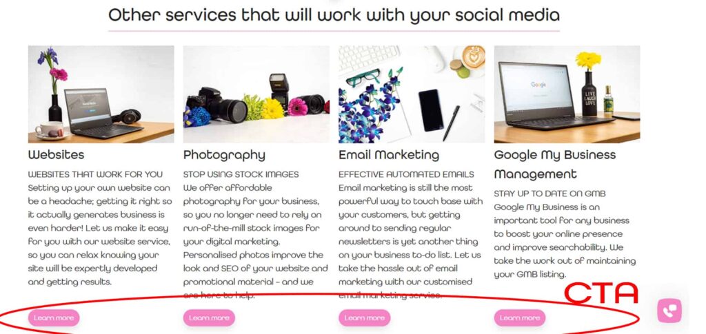
Customers need you to make it clear and easy for them to take the next step on your website. For example, if you want someone to call you, ask them to do just that with a button that clearly states “Call now”. For an ebook download, prompt them with a “Download ebook” button, or on e-commerce include a “Buy now” for products.
Include multiple CTAs across your website to cover each section and encourage engagement, but there is a fine line between enough and too many. If you would like an assessment on your website, click the button below and book a digital meeting with us (that is a CTA!).
Is your value clear?
When you make a purchase on a website, we bet you always do your due diligence by researching the products and checking customer reviews. Make it easy for your website visitors to choose your business by telling them exactly why your services and products are of value to them.
For example, if you are trying to sell a pillow, talk about how that pillow will improve their lives. Is it hypoallergenic, soft and provides ideal neck support? Choose value that sets your business aside from your competitors.
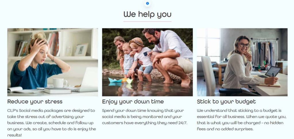
Below is an example of our value proposition.
If you need help with your website, contact us to discuss our services and obtain an obligation-free quote. Alternatively, check out our website packages and have our developers build you a quality, custom, fully-functional website that converts.